
James Fiesta Grill
Creating an intuitive website that will properly showcase a beloved Filipino restaurant for both new and loyal customers to utilize.
Design Process
Research
UX/UI Design
Branding
Prototyping
Usability Testing
Timeline
JULY 2024 - AUGUST 2024
(1 Month)
*Working on a part-time 20hr/week schedule
Problem
James Fiesta Grill has many photos and reviews online, but it lacks a dedicated website to showcase its offerings. Its online presence is scattered across platforms like Yelp and Facebook, making it inconsistent. As a small business primarily known within the local Filipino community, it relies on word-of-mouth. However, Google reviews suggest that outside customers may not always have the best experience.
Solution
I aim to create an intuitive website that effectively showcases James Fiesta Grill for both new and loyal customers. This will provide an opportunity to display high-quality photos of each dish, clearly list operating hours (as some reviews mention customer confusion), offer food ordering options for takeout, delivery, and catering, and share updates about the establishment.
The Research
With the problem and goal in mind, I began to plan out my research by gathering insights through 3 different methods:
Competitive Analysis
I assessed 3 local Filipino restaurants, focusing on how they promote Filipino culture and whether they utilize a website to enhance their brand visibility. This review highlights their strengths, weaknesses, and potential opportunities.
User Interviews
I spoke with 5 participants to gather their insights on what makes an intuitive website for a restaurant. This research will help design an effective website to attract new customers and increase profits for a small business.
**Key findings from my affinity map**
-
All 3 businesses provide Filipino cuisine through counter-service setups
They all focus on food delivery, pickup, and catering services
Their primary customer base seems to be Filipino food enthusiasts, with each business showcasing some form of Filipino culture
All 3 establishments operate small markets alongside their main offerings, with some overlap in products and customer service models
-
Mama Rosa Rotisserie Grill has a well-designed website with strong brand identity and clear interactive elements
Kuya Ja’s Lechon Belly has a more simplistic, but less user-friendly site. They also have 2 other chains that helps expand the business
Ligaya’s Filipino Food solely relies on its Facebook page posts authentic, unedited images regularly on social media, while the others rely on professional or aesthetic visuals
-
Having a Main Website: Can help establish credibility and expand reach. As well as enhancing engagement with new and current customers.
Better Product Presentation: Including more photos of dishes can engage customers, create stronger visual appeal, and drive interest in other menu items.
Online Ordering & Delivery Expansion: Adding features like online ordering, delivery, and catering options makes services more accessible to customers. as well as create additional revenue streams.
-
Customers rely on reviews, ratings, and photos to gauge the quality of the food and atmosphere.
A minimum of 4 stars on platforms like Yelp is expected.
Reviews help set preferences and expectations for the dining experience.
-
A well-designed website with easy navigation, high-quality images, and detailed descriptions is crucial.
Customers prefer websites with clear menus, location information, and online ordering options.
Having a modern, clean design with engaging visuals and accurate photographs is preferred.
-
Customers look for strong imagery, detailed descriptions, and relevant information like prices and menu options.
High-quality pictures, clear opening times, and information about special offers are important.
Visuals, clear menu options, and stress-free online ordering enhance the user experience.
Key Findings 📌
Owner's active engagement with customers are done through Facebook
Posts shoutouts and shares photos of orders, enhancing credibility and showcasing food quality
Additional posts consists of important updates like closures, keeping customers informed.
Secondary Research
I examined how the business operates on its primary online platform, Facebook. Many customers ordering are part of a mature audience. The demographic prefers viewing the business on Facebook over Google due to limited tech skills.
User Personas
I developed 2 personas that effectively represent the challenges and goals of my potential users, serving as a reference moving forward to align with user goals.
Customer Journey Map
To understand the potential feelings a users may experience when going through an app, I created a journey map to visualize the frustrations and delights of a customer. This helped me grasp how someone would benefit from an restaurant who has an intuitive website that will take online orders with ease.
Click here to view the full map.
Key Findings 📌
Customers love a fast, minimal-step checkout process with the option for mobile payments (e.g., Apple Pay). Manual card input adds unnecessary friction.
Clear, and high-quality photos of menu items are crucial; poor or missing images can lead to hesitation when ordering.
Users that are able to complete the ‘Ordering’ process in a easy layout increases the chances of buying more. It also helps with memory the next time they revisit the website.
Immediate confirmation screens and easily readable receipts are expected after placing an order. Delays or complicated layouts negatively impact the user’s experience.
POV and HMW Statements
With the research data, personas, and journey map in mind, I made it my goal to tackle this question:
User Flows
Going straight into the user flows, I developed 2 flows that showcases 2 pathways.
Click here to view the full flow.
Low-Fidelity Wireframes
I sketched out the key frames on paper to conceptualize the beginning stages of the layout, making it minimal and clean. Here, I laid out the main landing page, the menu, the transaction process, and a contact page, all while keeping the journey map and user flows in mind.
Mid-Fidelity Wireframes
As I began to work through my wireframes, I restructured the menu page where all the dishes are displayed. A peer suggested that the long format was tedious to scroll through, so I divided the content into sections for better readability. I also redesigned the category format, using cards with icons for each category, and made the pick-up and delivery buttons smaller.
Mid-Fidelity Testing
I was able to get in contact with 5 participants to see if I needed to make any more adjustments to my flow. Although the feedback from my peers was positive, many users suggested adding customization options for the dishes, as well as some clarifications of the classification of the dishes, such as what constitutes a spicy dish, a warm dish, or a cold dish.
“...easy to navigate; add allergy in descriptions, if they made a specific instructions add it through the checkout list, make an ‘add’ option together with the ‘remove’ option...”
“ I know that there are cold and hot desserts, but clarify the difference.“
“You should make ‘chef’s recommendation’ sign on certain dishes at the top right on the cards on menu...“
“ Since these are cultural dishes that not a lot of people know about, add spicy levels indicator, or even with seasonings, to help the customer choose a dish to their liking.“
Logo Design
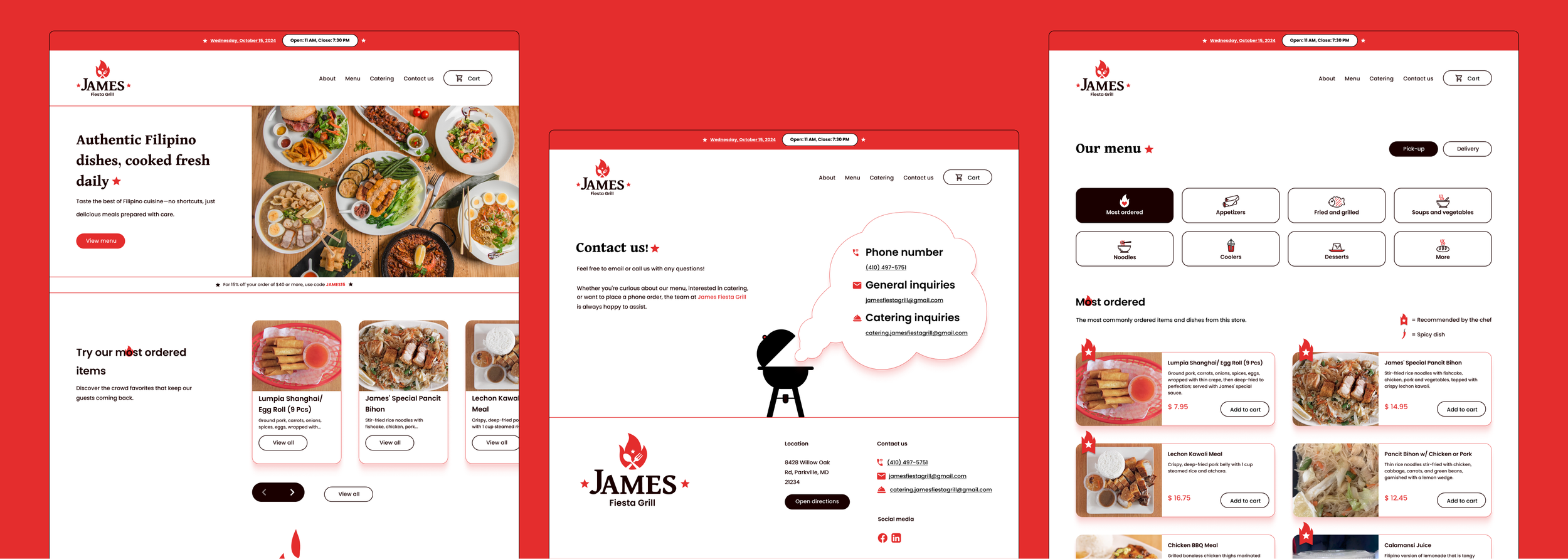
The original logo, while rich in design elements, appeared outdated and cluttered. I preserved the "James Fiesta Grill" structure but modernized the fonts, using Dai Banna SIL for "James" and Poppins for "Fiesta Grill." To honor Filipino culture, I retained the spoon and fork and included a third star above the utensils, referencing the Filipino flag. Lastly, I integrated a flame element to emphasize the "grill" theme, choosing a black and white color palette accented with red for contrast.
High-Fidelity Wireframes
The homepage offers users access to the restaurant's operating hours, current coupons and rewards, popular menu items, customer reviews, location details, and a dedicated contact page for catering inquiries and communication with the owner. To enhance visual appeal and reinforce the restaurant's branding, a grill illustration displays the contact information, adding warmth and character to the overall design.
Working on the menu section, users can browse through different food categories, view pictures of the dishes, and view a key indicating chef’s recommendations and spice levels. Users can choose between pickup or delivery based on their preference and have the option to add additional dishes or make special requests, such as removing a topping. After finalizing their selections, they can add items to their cart and proceed to checkout to complete the transaction.
I maintained a familiar and seamless transaction process by allowing users to enter their information, select a payment method, and view a confirmation screen with an order number for easy identification upon receipt.
High-Fidelity Testing
I was able to reconnect with the same 5 testers to revisit the project in its refined state and to see how their feedback from the first session played a significant role in the process. I was pleased to receive overall positive feedback, with only a few minor adjustments needed—one being the hero image, which I replaced with something more visually appealing instead of a fish head as the first thing users see.
“...change the hero image to something more appealing, I don’t think a lot of people will like the look of a fish head--I think this will effect first impressions depending on the viewer. “
“Easy process, feel familiar when comparing to other restaurant websites.”
“I like the convenience of the button in the same section for minimal scrolling...“
Iterations
With the feedback in mind, I’ve made the proper adjustments that made the features clearer to understand. I was able to switch out the hero image into something that will appeal to the audience more. So instead of one singular dish, I chose an image that showcases an array of dishes.
Other minor adjustments were made on the design side, where I readjusted the sizes of my icons to ensure consistency. Another aspect that was adjusted was toning down the opacity of the red ombre on the cards and making the height of the flame on the homepages slightly higher.
Prototype
To try out James Fiesta Grill’s website for yourself, click here!

Conclusion
I particularly enjoyed designing for a real business, especially one that holds personal significance. A key challenge was ensuring the website appealed to a broader audience while maintaining cultural authenticity. Since most of my testers were familiar with the establishment, it was exciting to receive overwhelmingly positive feedback on the site. Many users even expressed how useful it would be as a real website.
Although I have some ambitious design ideas, like making an event page or a customer appreciation page, they had to be set aside due to time constraints, but they still remain as potential future enhancements.