
Patchify
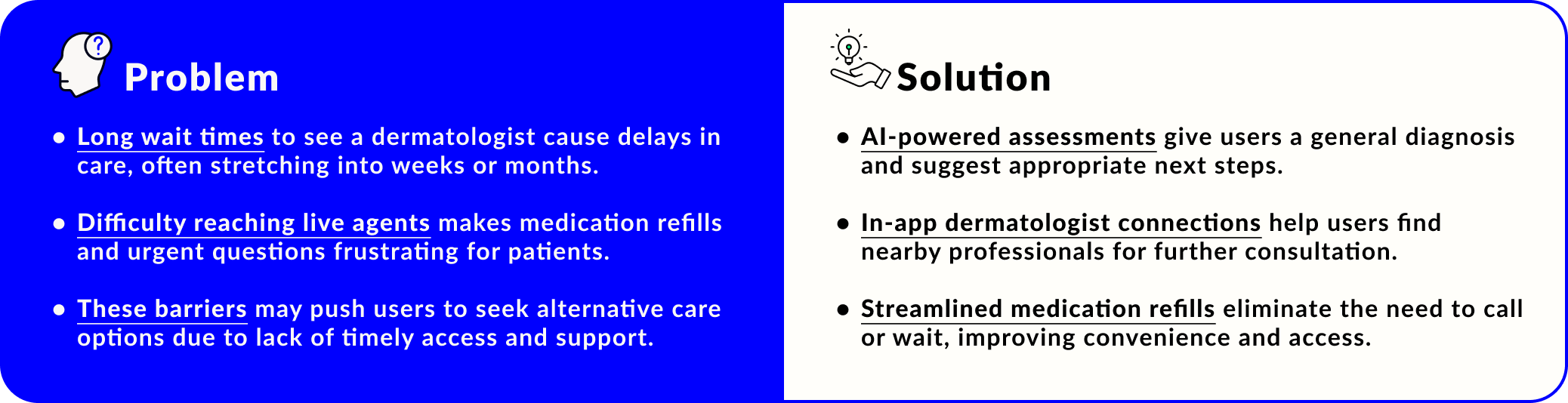
A telehealth app designed to identify various dermatoses conditions with the help of an extensive AI library. This can also help assist users with remote appointments, and medication refills.
Design Process
Research, UX/UI Design, Branding, Prototyping, Usability Testing
Timeline
2 months
Platform
iOS, mobile

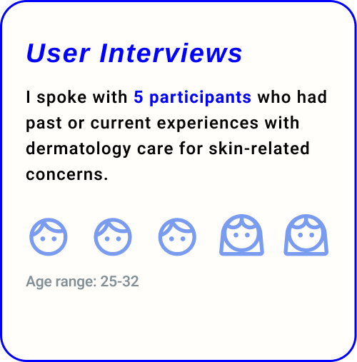
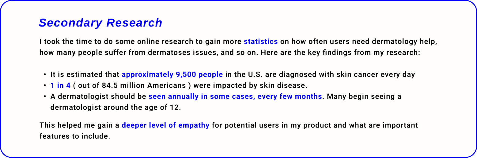
The Research
With the problem and goal in mind, I began to plan out my research by gathering insights through 3 different methods:

-
Offer online skin care diagnosis and treatment services
Have a secure and private way of storing user information and data
Accessible to users of all ages
-
Aysa seems to use AI technology, while DermatologistOnCall and First Derm use real live dermatologists
The costs and payment options for these services vary
-
Include follow-up appointments to build patient to doctor relationships
Highlight credentials and educate users on AI diagnostics
Explore prescription integration for medication refills
Streamline account management, and address user concerns efficiently
-
Reaching a receptionist due to long wait times
Limited availability with specialists
Finding establishments that will accept certain insurances
Bookings dates being weeks or even months away
-
Clear communication, guidance, and follow-ups
Access to medical records and information about their medications
Credentials and qualifications of the professionals are important
Value respect and transparency from doctors
-
Since the app involves medical records, users are stressed the importance of privacy and security. Such as acknowledging the importance of HIPAA and data security.
Users prefer a visual library mixed with brief explanations over FAQS to be the most helpful when pinpointing conditions.
User Personas
I developed 2 personas that effectively represent the challenges and goals of my potential users, serving as a reference moving forward to align with user goals.
Customer Journey Map
To understand the potential feelings a users may experience when going through an app, I created a journey map to visualize the frustrations and delights of a customer. This helped me grasp how someone would benefit from an app that provides telehealth.

POV and HMW Statements
With the research data, personas, and journey map in mind, I made it my goal to tackle these 3 questions:
User Flows
I developed 3 user flows that showcases 3 pathways. Illustrating how each of the pathways the users will take as they navigate through the app, helping me identify potential pain points.
Click here to view the full map.
Low-Fidelity Wireframes
The main tasks developed included onboarding, photo analysis, locating a dermatologist, and requesting medication refills. I prioritized user needs to ensure the app would be beneficial for potential users.
Mid-Fidelity Wireframes
After reviewing my low-fidelity sketches and task flows with my mentor and peers, we identified 3 key areas in 2 features where usability and visual hierarchy could be improved.
Mid-Fidelity Testing
After making my adjustments, I contacted 5 participants to test 5 tasks to see if the flow of the frames and the organization of the features made sense. Although the feedback I got from my peers were positive, there were some suggestions to improve the user experience of the app.
“Some of the icons were a little hard to touch and see, so maybe making them a little larger would help.“
“The photos in the instruction section was maybe a bit too big but the section is very helpful otherwise.“
“Instead of the date outside of the cards, place date within the case card and instead of ‘today’ put ‘recent activity’ or ‘your medication’ and ‘your appointments’.“
“I like adding thing to my calendar, so I would like a pop-up option for me to add it to my iphone’s calendar!“
“Maybe pop-up message would help me because seeing that the app pre-selected my area i got confused...”
Logo Design
I had several logo ideas for my product, focusing on its core feature—photo analysis. Inspired by real-life practices and app store designs, I narrowed it down to a magnifying glass and created 7 variations.
**User has given me their consent to share our conservation**
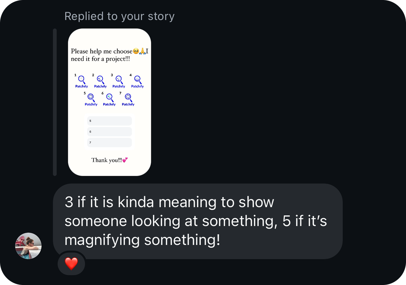
Since I made too many, it was really difficult to decide on which best suited the product. So, I took it to social media and grabbed unbiased opinions by creating a poll. And to my surprised, people were very responsive and helpful!
Design System
I aimed to create a product that embodies trust, reliability, inclusivity, and empathy—key values for any medical-related brand. To achieve this, I incorporated warm, and friendly illustrations to enhance storytelling, especially during onboarding. For the color palette, I chose shades of blue, a familiar color in healthcare, complemented by a pop of green for a modern, fresh touch.
High-Fidelity Wireframes
Onboarding and Sign up Process
Begins with welcoming illustrations and a straightforward, user-friendly sign-up process. Users can upload their medical insurance information right away or choose to add it later, offering flexibility.
Photo Analysis Feature
Users are able to snap a photo of a specific area of concern, fill up a quick questionnaire, and allow the AI to process their information for a general diagnosis.
Mini Tour
A friendly empty-state illustration is introduced on the homepage to prompt users to engage. To maintain engagement, each icon is highlighted as its purpose is explained.
Find Your Doctor
After receiving a diagnosis, users can choose to consult a professional to minimize risk or save the case for later review.
Medication Refills
Users can remotely request refills of their prescriptions from their profile while also accessing other sections of the app.
High-Fidelity Testing
I connected with some previous participants and a few new users to gather fresh insights on the product. They completed various tasks while providing feedback on potential improvements. Overall, the feedback was predominantly positive, with only minor design adjustments needed.
“ Maybe consider changing the color of the green and make some paragraphs larger ( a bit ) to help with older eyes. “
“ Maybe fix the green shade...maybe make the arrow drop down icon a bit later to hit easily... ”
“ Maybe fix the green shade and make the arrow drop down icon a bit later to hit easily... ”
Getting Expert Advice
During both of my testing phases of my project, I was able to get the help of a co-worker and friend who currently works as a UX Writer.
She gave me excellent feedback on how to further improve the speech and language of my text to better resonate with the user, as well as providing reasoning on why one language should be switched one way or another. These tips allow me to think thoroughly about how I should communicate with the user, since writing for my projects has always been a challenge for me.
“Add ‘your’ between 'dermatology’ helps with personalization ”
“Replace ‘no’ with ‘start’ or ‘start your first analysis’—helps with action“
“Add an extra frame separate the photos to confirming the photo—add an upload icon to get photo from in phone gallery…“
“Change the order of the yes and no options—helps with patterning…“
“Say something more like ’ensure the problem area is in focus to help the AI pinpoint the diagnosis’—makes it less wordy ”
Iterations
I’ve made adjustments based on feedback to clarify the features and enhance the design. I explored the camera feature for photo analysis, and a user suggested adding another frame for photo confirmation before proceeding. Additionally, allowing users to upload their own photos could improve the experience.
Minor design adjustments include highlighting the navigation bar icons for better user orientation within the app. Additionally, reducing the opacity of section-separating lines was suggested. Changing the accent color's saturation is also considered, as some users find the original shade too jarring.
Prototype
Click the link here to try Patchify for yourself!
Conclusion
There are many opportunities to expand the usability of this app. Such as adding a tracking feature of patients progress, push notifications, chatroom and messaging, or a symptom log between patient and doctor. Since this project only covered the MVP, there’s a lot of room to grow.
A lot of my users were very excited about the product, and some have mentioned how they wish telehealth were as intuitive and convenient as mine. Not only did this boost my confidence for future projects, but it also made me feel accomplished in achieving the goal I set for my users in this project.