
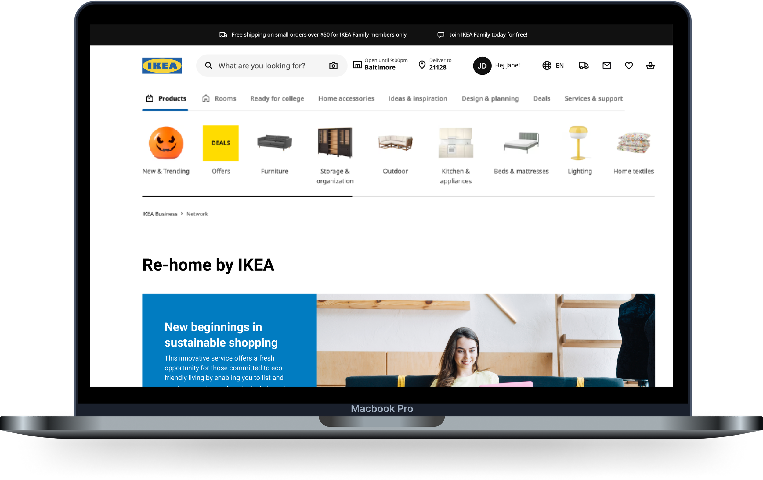
Re-home
A feature that allows customers to put up their unwanted IKEA products to a resale feature as a solution to a more eco-friendly approach to furnishing homes.
Design Process
Research
UX/UI Design
Prototyping
Usability Testing
Timeline
AUGUST 2024 - SEPTEMBER 2024
(1 Months)
*Working on a part-time 20hr/week schedule

Problem
While IKEA ‘s affordable and trendy pieces encourage experimentation, this can lead to hefty returns. With their generous return policy—365 days for new items and 180 days for opened items with proof of purchase—customers who miss the deadline are ineligible for refunds, resulting in dissatisfaction. IKEA also has a Buy Back and Resell program that has limitations on eligible items, leaving some customers unable to trade in unwanted furniture.
Goal
Introduce a resale feature that reinforces IKEA’s commitment to sustainability, community, and eco-friendly solutions. Allowing their customers to remotely list out their unwanted products without the hassle of traveling to the store and addressing the issue of the missed return window.
The Research
With the problem and goal in mind, I began to plan out my research by gathering insights through 3 different methods:
Competitive Analysis
Evaluated 3 platforms to better understand their strategy in assisting users to effectively resell and browse products.
User Interviews
I spoke with 5 participants to discuss about their individual experiences when shopping for home decors in order to develop a more effective feature aimed at helping the customers purchase furniture sustainably.
**Key findings from my affinity map**
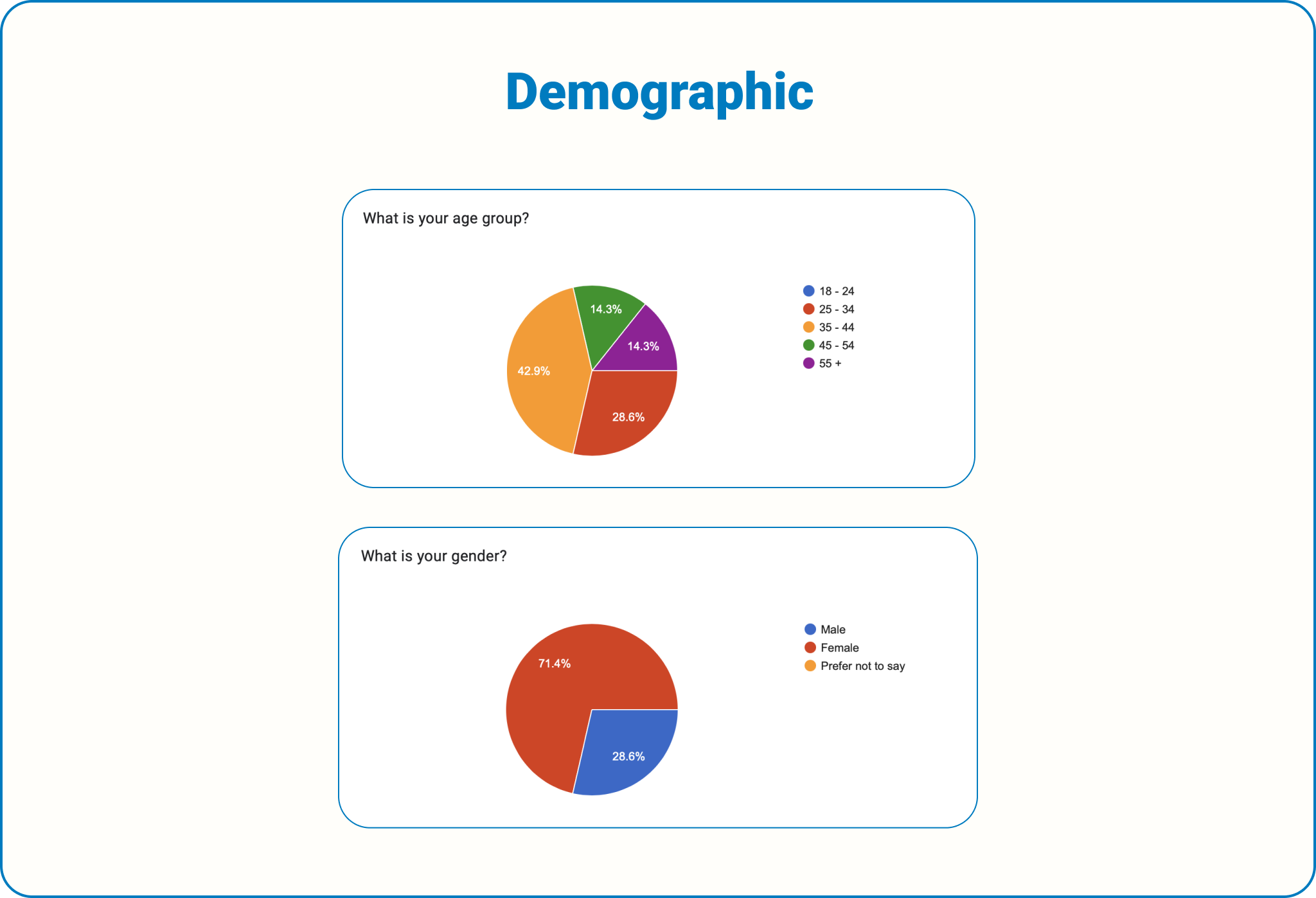
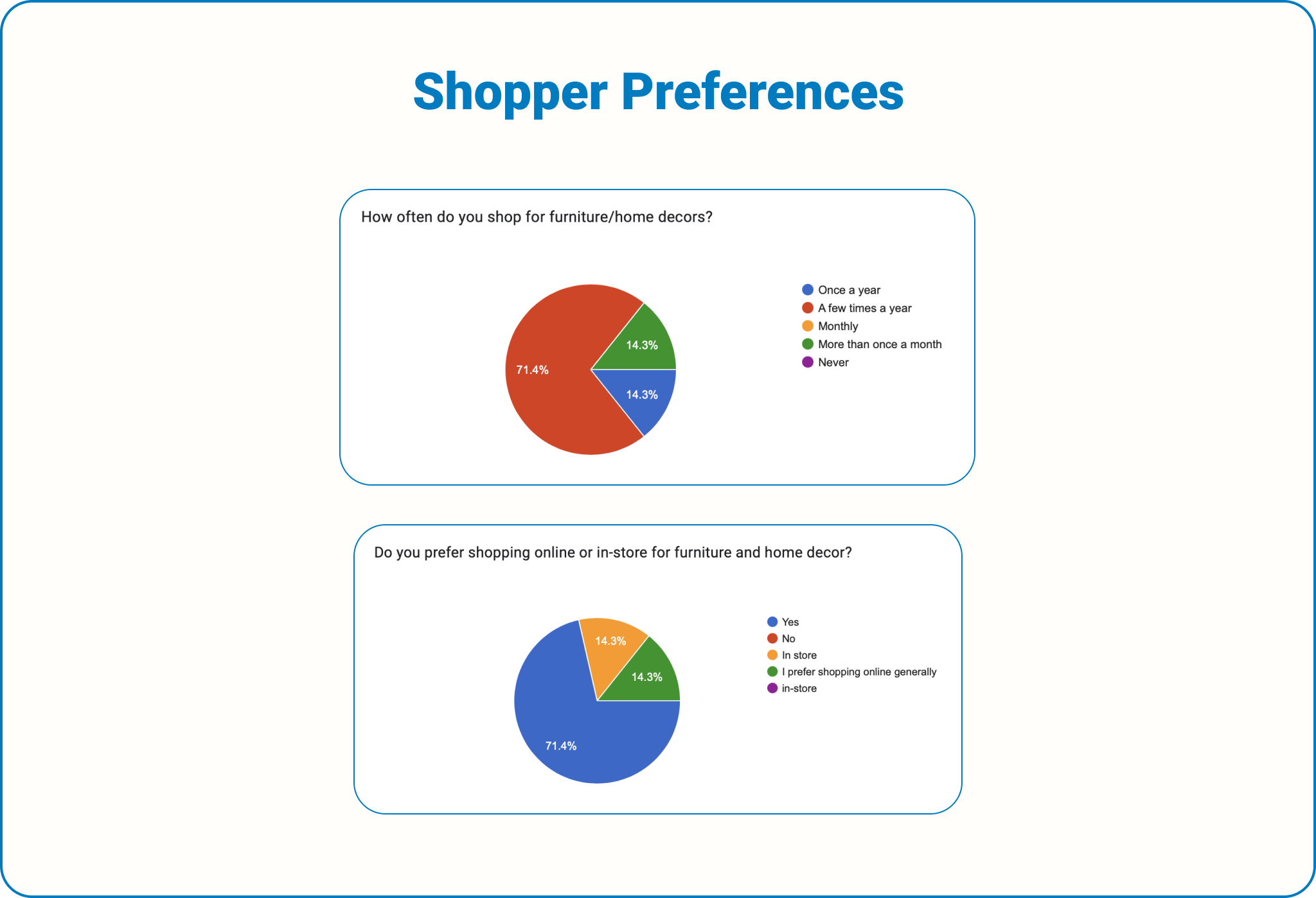
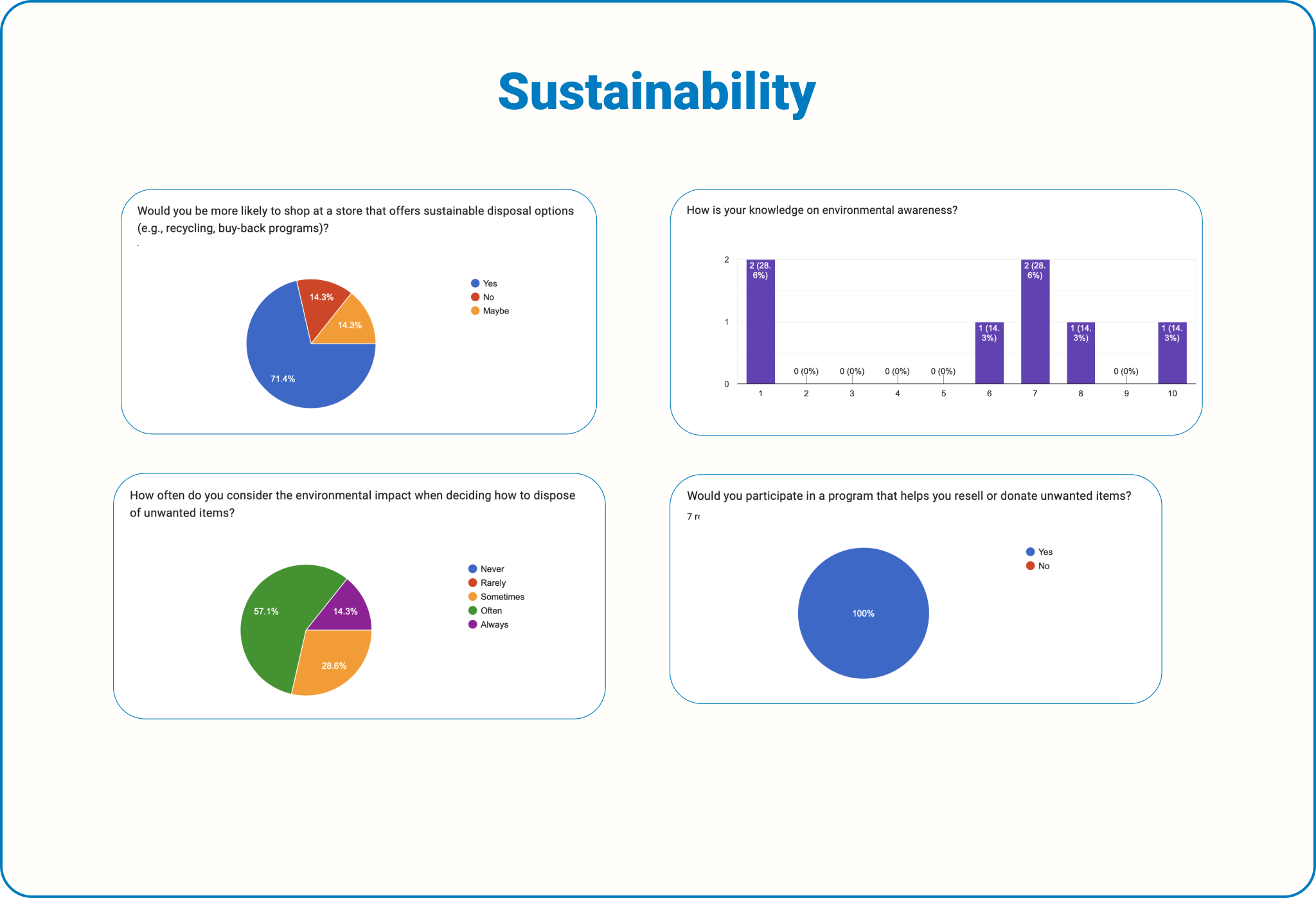
Conducting Surveys
Developed a questionnaire to understand consumer habits, preferences, and experiences in shopping, returning, and sustainability practices. This includes 20 questions and 2 conclusions, taking 5-10 minutes to complete:
**Key findings from the data collected**
-
Each platform allows users to interact with sellers through product listings, though the extent varies
All 3 platforms have usability issues, such as poor organization (eBay), lack of filtering capabilities (AptDeco), and unclear product photos (Facebook Marketplace)
Users across platforms struggle with trust issues, including counterfeit products (eBay), legitimacy concerns (Facebook Marketplace), and poor service experiences (AptDeco)
-
Facebook Marketplace benefits from its large user base and social integration
eBay excels with deals, coupon codes, and brand partnerships
AptDeco focuses on sustainability and a guided shopping experience
Facebook Marketplace takes a 5% selling fee, whereas eBay earns revenue from various fees
eBay has customer complaints about poor service and counterfeit products
AptDeco struggles with cancellation policies and filtering reviews
-
Enhancing seller verification and trust with the consumers
Improving user experience and product organization
Streamline customer services and transparency with the brands values
-
Individuals prefer shopping in-store than online
Authenticity and quality can strongly influence one’s decision to purchase
Frustration arise when cheaper options are found after a purchase
-
Shoppers stress the importance of quality over price
Worried about getting products that look nothing like they were portrayed online
Prefer shopping in-store due to concerns of security and safety
-
Awareness about these topics varies but some are seeking more education on sustainability
Some express interest when given the option of going green while shopping
-
Many individuals mention regifting, donating, or selling unused products instead of disposing an item completely
Mixed feelings about returning items due to the hassle of the process
Some participants update their spaces seasonally or as part of ongoing efforts to beautify and organize their homes.
Many participants shop for furniture and decor during life changes like moving, relocating, or buying their first home.
Changes in personal taste, wear and tear of furniture, or the need to streamline spaces prompt furniture shopping.
Many focus on specific needs, like: color scheme , space organization, or furnishing other properties like beach houses.

User Personas
I developed 2 personas that effectively represent the challenges and goals of my potential users, serving as a reference moving forward to align with user goals.
POV and HMW Statements
With the research data and the personas, I made it my goal to tackle these 2 questions :
User Flows
Going straight into the user flows, I developed 3 flows. These flows show the 3 pathways .
Click here to see the full flow.
Low-Fidelity Wireframes
To ensure consistency with IKEA’s established layout, I developed my frames by using screenshots from their website as references, while also aligning them with my user flows.
There was a challenge of identifying the exact measurements for the frames from the original layout. Some placements, like the chat box, were awkward when translated to my screens, leading me to estimate measurements to achieve accuracy.
Mid-Fidelity Wireframes
Before going into my first round of testing, I added a couple more frames and elements to help with the flow of the tasks. As well as, other adjustments made based on feedback I got from my mentor and group critiques.To start, I added the new CTA button at the top of the original home screen to navigate users to the added feature while aligning with the way IKEA updates their website.
My peers pointed out that requiring users to message the seller first can result in lost interest and discomfort. To address this, I enhanced the visibility of the ‘Add to Cart’ button while keeping the message option. I also added a detail showing how many other users are viewing a product to create urgency and encourage quicker purchase decisions.
I added additional frames to illustrate how the chat room will operate along with the end result of the transaction process to demonstrate that the transactions between the buyer and seller was successful. Initially, I planned to show the full transaction process but struggled to find an up-to-date reference. Since the process is straightforward, I was advised that concluding with a confirmation screen is best, as it is the only reference I found that supports this choice.
The last adjustment made was to enhance the seller's flow to allow the users to create a listing in full detail. Then ending the flow with a confirmation screen not only confirms the success of the upload but also acknowledges the seller's commitment to sustainability, reinforcing IKEA's brand values.
Branding
I focused on maintaining consistency with IKEA’s established branding by matching their signature blue and yellow color palette, text hierarchy, and iconography.
When translating my designs to match IKEA’s format, I closely referenced IKEA’s existing website. For instance, I used their chatbot as a foundation for my chatroom design, ensuring it felt like a natural extension of their brand.

Mid-Fidelity Testing
I was able to get in contacted with 5 participants to see if I need to make anymore adjustments to my flow. Although the feedback I received was positive, many of my users had suggestions regarding the design aspect. But because I am adding a feature to an existing website, I had to communicate to the participants that I had to adhere to the UI kit of the company.
“I didn’t see the message icon--the icon could be more visible...”
“I thought the message icon and the add to bag button were together; wants the message button next to meet the seller.“
“I thought the task was fine, but I thinks that instead of having the steps in one page, breaking it up might be better.“
“The icons and too small for me to see...“
High-Fidelity Wireframes
The consumer flow begins with users browsing categories for items, starting with 'Furniture,' which displays a list of available products. Each product listing includes: retail and resale prices, reason for sale, listing date, seller's name, messaging option, delivery or pickup methods, and current user views.
I opted for real photos from Facebook Marketplace, ensuring no identifiable information was present to protect privacy.
If the user messages the seller, they get default message prompts to start the conversation. After starting the chat, the user can complete the transaction using a secure payment link sent by the seller, ensuring a smooth buying experience. This feature helps clear communication between buyers and sellers, minimizing misunderstandings during the transaction.
When refining the seller flow, I ensured it was seamless and straightforward, providing concise information about the product they wish to list.
High-Fidelity Testing
With a mix of old and new participants, I was happy to hear that the feedback was mostly positive. But there was a common confusion when I asked them to search for a specific kitchen table. Another aspect that was confusing was trying to locate key buttons for certain tasks.
“I would like the listing option in the homepage...having a separate link next to ‘shop now’ button would be easier.“
“Another selection from the categories in ‘kitchen’ or other related categories to a new pages where it shows kitchen related items would help...”
“I would suggest showing other selections of other kitchen islands style below if this option doesn’t work; similar to Amazon...something like that would be nice...”
“Finding the ‘listing’ button was a little hard to find...“
Iterations
I added an additional card for the ‘Listing’ button to improve its visibility, as some users found it difficult to locate. They also commented that it was too small and easily overlooked. To align with IKEA’s branding, I extended the ‘Re-home’ section with a distinct card for the button, as well as cards outlining the benefits of choosing ‘Re-home’.
One user pointed out that having a “Related Product” section aids in product suggestions while refining the customer’s search to help narrow down their desired item. They mentioned how websites like Amazon provide similar items to help narrow down choices, making the browsing experience more efficient.
Prototype
To try out Re-home for yourself, click here!
Conclusion
Adding a feature to one of my favorite brands was very fun to explore. In the future, I would like to explore a few more additions that would make this app more effective since this projects the main MVPs. Such as: incorporating a point system to add to IKEA’s existing membership, a tracking system to help users view their delivery, or an AI system to help IKEA take down false sellers to aid in security of their customers.
Seeing this project come to life made me think of all of the possibilities of how this can be pushed further to assists people’s needs.